"A good sketch is better than a long speech..." -- a quote often attributed to Napoleon Bonaparte The ability to visualize the implications of data is as old as humanity itself, and due to the vast quantities, sources, and sinks of data being pumped around our global economy at an ever increasing rate -- the need for superior visualization is great and growing. To give dimension to the size of the challenge, we should remember that EMC reports that "digital universe" added 487 exabytes, which is 487 billion gigabytes in 2008. By 2012, we will add five times as much digital information as we did in last year!
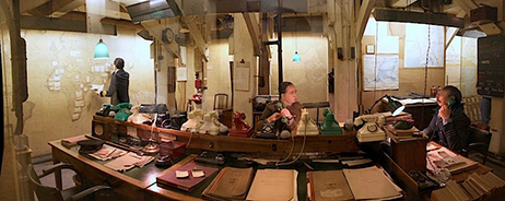
I believe that we will naturally migrate toward superior visualizations to cope with this information ocean. Since the days of the cave paintings, graphic depiction has always been an integral part of how people think, communication, and make sense of the world. In the modern world, new information systems are at the heart of all management processes and organizational activities. About ten years ago, I vividly remember visiting the basement of Whitehall, where Churchill had his war room during WW II. Below is a picture in which you can see the desks full of phones, and the walls covered with maps and posted data. On the one hand, I was struck by how primitive their information environment was only sixty years ago, but on the other hand I found it reassuring to see how similar their approach was to war fighting today. Today's mode, quality and speed of data capture changed greatly from the 1940s, but the paradigm for visualization of the terrain, forces, and strategy are almost identical to those of WW II. So, the good news is that even in a world of information surplus, we can draw upon deep human habits on how to visualize information to make sense of a dynamic reality.
What has changed since Churchill was chomping on his favorite cigars, and sleeping in what looked like a very uncomfortable cot in the basement of Whitehall? The quality, timeliness, granularity, and volume of data has increased greatly. Also, with the ever improving assistance of Moore's Law, we have the power to recombine and analyze the vast stream of information at a price point that makes even very advanced visualization techniques within the reach of any business. So what? In my work with clients, I've seen three primary benefits of superior graphic representation: first, great visualizations are efficient -- they let people look at vast quantities of data quickly. Second, visualizations can help an analyst or a group achieve more insight into the nature of a problem and discover new understanding. Third, a great visualization can help create a shared view of a situation and align folks on needed actions.
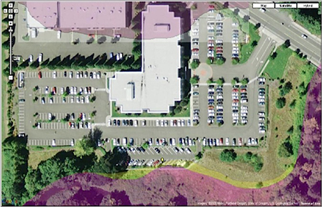
Below is an example of a data visualization used by one of our property casualty insurance clients that takes information from Google Earth, and overlays flood plain data onto an ariel photo of their client's commercial building. One can clearly see that a big portion of the building complex framed in the top of the picture lies within the flood plain. This picture makes it much easier for the insurance sales person to show the company why they may be paying a higher premium. It also allows for clearer internal dialog between the salesperson and the underwriter -- speeding communication and collaboration.
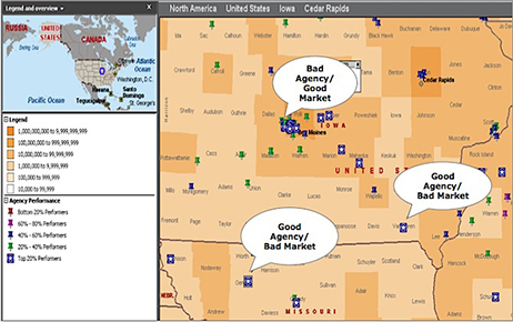
In addition to arranging the information to create shared understanding, the ability to combine data in order to create new insight -- fast, and clear. Wired has a wonderful graphic showing the seven deadly sins by state across the USA. As I've written about before, my firm is working on a system we call the Demand Estimator, which makes it easy for management teams to overlay information -- both internal and external data -- onto a map. This enables analysis of key dimensions of performance. When I was a professor at Harvard Business School, my degree was in management information systems and we often looked at how managerial control systems focused the effort of the organization, and helped leaders keep the many folks inside an organization focused on the right things, day in and day out. One of the great challenges in any field force is to make sure that they are always turning their attention to the customers and markets that have the most potential. Furthermore, a perennial problem in managing any field salesforce is the evaluation of salespeople. A key question you want to answer is: is my salesperson strong? or are they simply in a very good market? For property casualty insurance companies this is often a difficult question to answer. The graphic below shows a big section of Iowa and a little of the surrounding states, depicting potential demand in the market by darker colors. We gathered this information from external sources and matched it down to localities by state. This "layer", if you will depicts the market potential. The next layer was to add the performance of agencies -- which you can see is annotated by having different colored markers. In the graphic below, we can see that there are "good agencies" in "bad markets" and vice versa. This is vital information for sales management to know when they are allocating resources to train and build up agencies.
Where is all this going in the future? I believe that we will continue to get more and more large screens and projectors, with high resolution to display data. The average American household has increased its "screen-estate" significantly in the past few years -- with big TVs, more and larger computer monitors. The same is becoming true of companies -- and this will help to set the stage for more visualization. The quality of cheap mapping tools and the availability of vast quantities of data for very little money is growing. The planet is becoming "smart" in the sense that we can track, monitor and see much more of both the built and the natural environment.
The challenge is that if management teams do not consciously build in great visualizations, their organizations will waste an inordinate amount of time sifting through the river of bits, and not get the effective insights needed. Perhaps most perniciously, people will each be looking at their own part of the puzzle, and not getting to a share understanding in a way that motivates teams to take corrective action in the time window needed.
Ask yourself the following questions:
- Is there a simple map or maps of information that could make my life easier?
- Do we have the ability to take the myriad data and synthesize it into these new forms?
- How much time does the organization waste arguing about the facts instead of deepening understanding or crafting solutions?